HAP
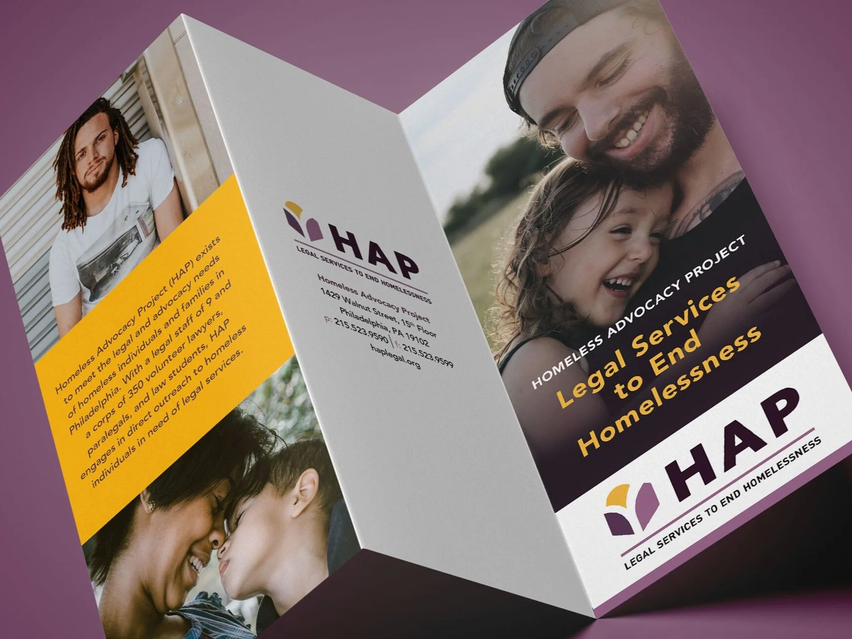
The Homeless Advocacy Project (HAP) came to us as a well-respected organization in Philadelphia facing a difficult task. Although they provide life-changing legal services to the community’s most vulnerable population, they were constantly mistaken for a homeless shelter. This confusion muddied HAP’s identity, as there was a lack of awareness in the services they provide among the clients and general public. Our task involved restructuring their brand in a way that reflects their real mission.
From the barest essentials, HAP’s verbal identity failed to clearly articulate their legal services. The previous logo, which resembled a house, added to the mistaken identity as a homeless shelter and didn’t appear welcoming to the people it was meant to reach. Because the organization is referred to around the city as “HAP”, we applied this acronym as well as the tagline “legal services to end homelessness” to the logo.
We drew inspiration from a sunrise as a start of a new beginning and updated the brand imagery with warm and inviting colors. With a more accurate tone and messaging, HAP now has an identity that conveys its purpose.
Key Deliverables
Qualitative ResearchBrand Voice & Message PlatformBrand Identity & Visual LanguageBrand Identity GuidelinesWebsite Design & DevelopmentMarketing MaterialsEnvironments & Signage